Active element that displays an image depending on the value of the parameter and that can be clicked to increment the value.
It is as an animation or 'filmstrip' for which the image is chosen depending on the value of the parameter: if the parameter value is equal to its minimum the first image is displayed. If the parameter value is equal to its maximum, the last image is displayed.
The control supports several keyboard shortcuts and mouse click: Each time the user clicks on the button, the parameter is incremented to next value (the number of possible values depending on the number of images). For more information, see Param Control widgets user experience. In practice the button will be used for boolean parameters or integer parameters that do not have more than 3 values.
See the attributes common to all param control widgets.
| Name | Value Type | Default Value | Description | Comment | V. |
|---|---|---|---|---|---|
| Images | |||||
|
image |
valid image file path |
empty |
Image file containing the list of images to display. |
It is a single image containing a 'film strip' with many images. It can be vertical or horizontal, see the image_orientation attribute. |
1.0 |
|
image_mask |
valid image file path |
'image' value with '_mask' postfix |
Path to the alpha mask for previous image. |
This value is optional since by default it is generated from 'image'. |
1.0 |
|
image_disabled |
valid image file path |
'image' value with '_disabled' postfix |
Image file containing the list of images to display when the control is disabled |
This value is optional since by default it is generated from 'image'. |
1.0 |
|
image_disabled_mask |
valid image file path |
'image_disabled' value with '_mask' postfix |
Path to alpha mask for previous image |
This value is optional since by default it is generated from 'image'. |
1.0 |
|
image_hover |
valid image file path |
'image' value with '_hover' postfix |
Image file containing the list of images to display when the mouse is over |
This value is optional since by default it is generated from 'image'. |
1.0 |
|
image_hover_mask |
valid image file path |
'image_hover' value with '_mask' postfix |
Path to alpha mask for previous image |
This value is optional since by default it is generated from 'image'. |
1.0 |
|
image_focus |
valid image file path |
'image' value with '_focus' postfix |
Image file containing the list of images to display when the control has focus |
This value is optional since by default it is generated from 'image'. |
1.0 |
|
image_focus_mask |
valid image file path |
'image_focus' value with '_mask' postfix |
Path to alpha mask for previous image |
This value is optional since by default it is generated from 'image'. |
1.0 |
|
image_pushed |
valid image file path |
'image' value with '_pushed' postfix |
Image file containing the list of images to display when the button is pushed. |
This value is optional since by default it is generated from 'image'. |
1.0 |
|
image_pushed_mask |
valid image file path |
'image_pushed' value with '_mask' postfix |
Path to alpha mask for previous image |
This value is optional since by default it is generated from 'image'. |
1.0 |
| Other settings | |||||
|
images_count |
Positive integer |
0 |
Number of images in the film strips contained in the image files |
All image files must contain the same number of images |
1.0 |
|
image_orientation |
vertical |
Orientation of the image file containing the film strip images |
|
1.0 |
|
|
loop |
true |
Enable loop for the the button values. |
When disabled, the button won't loop back to the minimum value when reaching the maximum value. |
1.3 |
|
Display an 'On/Off' two states button for a boolean parameter, with a transparent image and the system hand cursor when the mouse is over it:
<?xml version="1.0" encoding="utf-8" ?>
<SKIN language_version="1.0" background_image="bg.bmp" repeat="true">
	<IMAGE_PARAM_BUTTON param_id="dsp.input0" image="on_off_button.bmp" images_count="2" image_orientation="horizontal"
		cursor="system::hand" />
</SKIN>
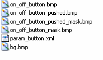
Folder content:
|
on_off_button.bmp

|
on_off_button_mask.bmp

|
|---|---|---|
|
on_off_button_pushed.bmp

|
on_off_button_pushed_mask.bmp

|
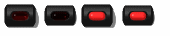
Result:
| (the pictures show the widget for different values of the parameter) | |||
|---|---|---|---|

|

|

|

|
|
State 0 |
State 0 pushed |
State 1 |
State 1 pushed |
The previous example can be improved by adding two images to the folder: darken the on_off_button.bmp and add on_off_button_focus.bmp and on_off_button_hover.bmp which are copies of the original on_off_button.bmp image. You will obtain a button which looks brighter when the mouse is hover it or when it has keyboard focus. This can greatly improve the user experience with very little effort.
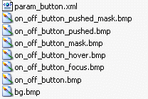
Note that there is no need for a on_off_button_focus_mask.bmp or on_off_button_hover_mask.bmp, since the mask is the same as for the on_off_button.bmp and the system automatically uses the on_off_button.bmp mask for suffixed images (see about images for more details about default masks and suffixes.)